logo

Data Visualization Spring 2018 course | GSAPP | Columbia University

Home Assignment 3 Assignment 4.1 Assignment 4.2 Assignment 5 Assignment 6 Assignment 7 Critique Final Project

Critique of Data Visualization

Swimming World Records throughout History

We live in a world of information exploration and yet we do not even notice how that data interacts with our daily life. Data mostly comes with large amounts of numbers or texts from different organizations of data sources. The question is how could we visualize these mass data representations to the world, and how do we interact with this data? ‘Information visualization as a mapping between discrete data and a visual representation. We can also use different concepts besides “representation,” each bringing an additional meaning.’ (Lev Manovich 2010)
homepage
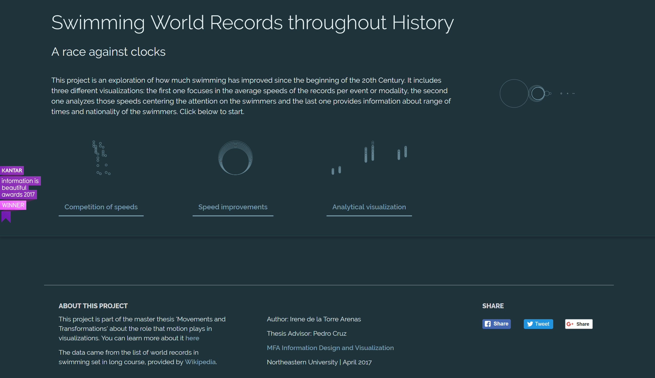
I am going to critique one example of data visualization ‘Swimming World Records throughout History’, a master thesis ‘Movements and Transformations’, by Irene de la Torre Arenas who is a student from Northeastern University. The data source comes from the list of world records in swimming set in long course, provided by Wikipedia. Here is the data visualization website link https://irenedelatorre.github.io/swimming-records/index.html Feel free to explore.
To know the audience is important. It will help the author to set up distinct principles and build multiple methods to represent the data. In this case, I think the audience is people who are interested in swimming or professional swimmers who can track their speed and path in the past. I like the data sets that have a clear structure: average speed (from the recording and calculating distance and time) by events, swimmers, gender, and date. This helps the viewer to understand what information will be represented as well as helps the author to set a clear goal to express a visual structure. There are three different visualizations: the first one focuses in the average speeds of the records per event or modality, the second one analyzes those speeds centering the attention on the swimmers and the last one provides information about the range of times and nationality of the swimmers. ‘This type of the reports and presentations, or the authors of the more experimental visualizations featured on.’ (Lev Manovich 2010).
datavizpage1
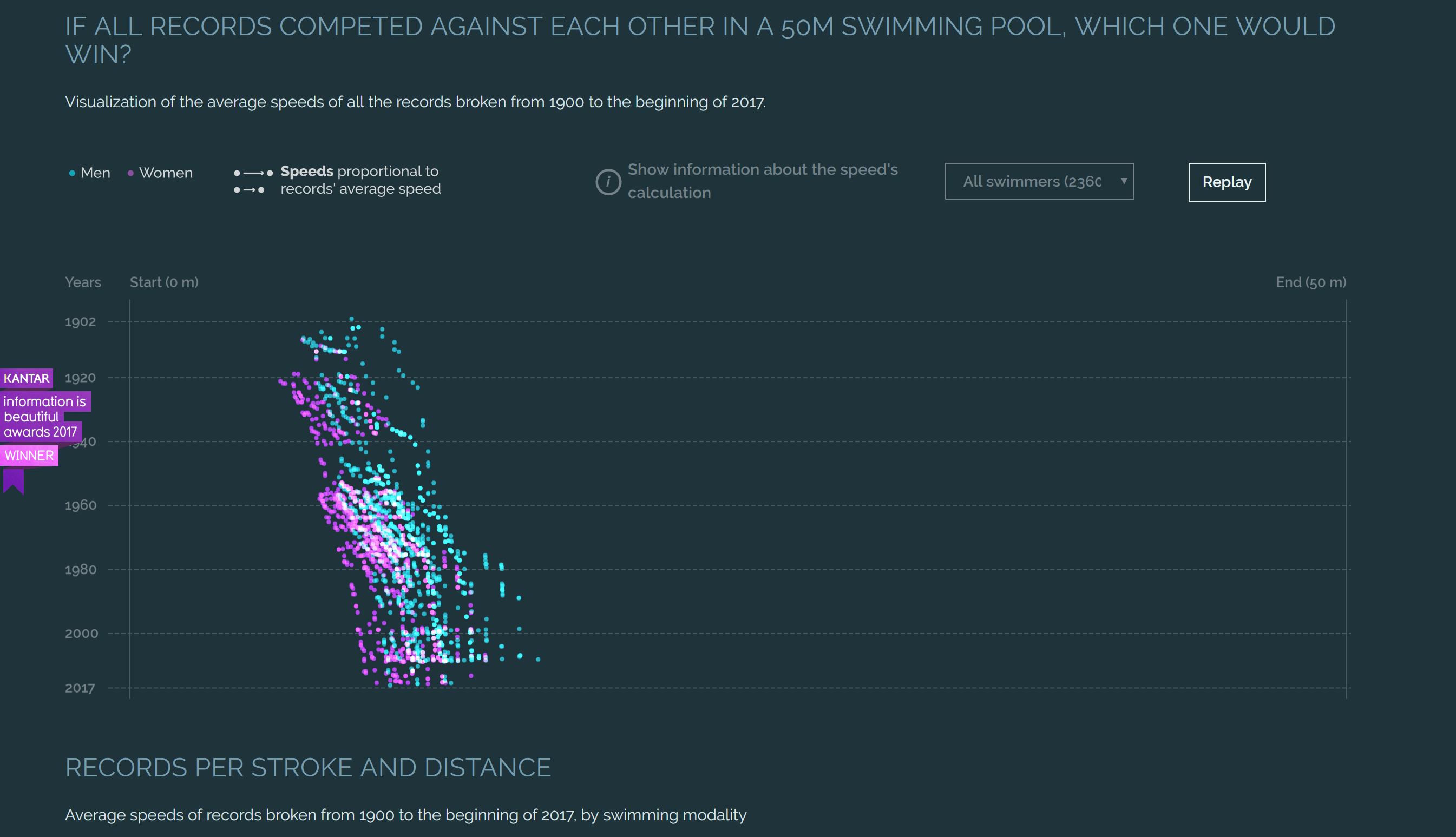
The first chart graph as a layout of the swimming pool (X as a distance, Y as years from 1902 to 2017) and each dot represent a swimmer competing for each other by speed. I think the animation movement was basing on swimming action in the competition from start to end. It is really clever to represent the speed data and display the principle idea in the graph. I like the colors has been chosen was based on gender, but it will be better split two of them instead show them together. You can also track on the swimmer by their name to see their speed in each event such as 200 meters backstroke or 4 X 100 meters medley relay from what year. If you move your mouse to each dot, it will show more specific information. This interactivity gives the viewer more participation in this representation. However, I think data is unrepresentative, or rather what does this data represent? I am sure there are many of data sets of swimmers, but they only choose some of the spotters. Were they all champions? The author should explain more about why they only pick this specific data. What decision has been made to visualize this data?
datavizpage2
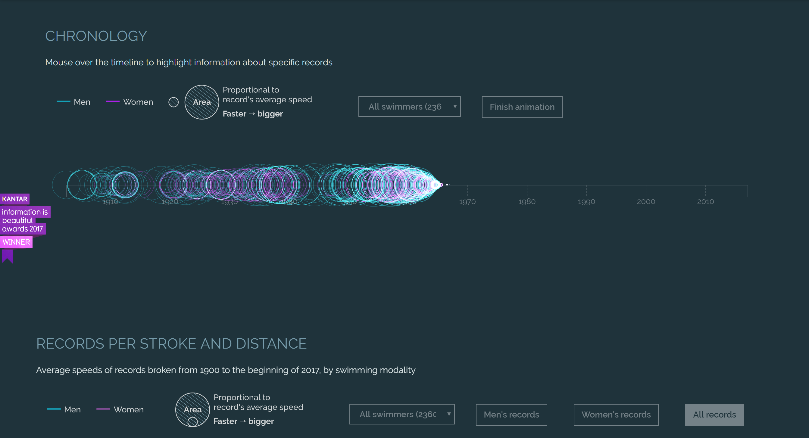
The second one analyzes those speeds centering the attention on the swimmers improvements from 1900 to 2017. I like how speed improvements have been visualized when the mouse moves over each playfair’s circle to highlight information about specific records. Circle graphics was displaying the magnitude size by using object codes. ‘Palyfair’s circles, an early use of the area to show magnitude’. (Tufte, Graphical Integrity) It is the same interaction strategy as the first chat graph. However, I think this visualization is not consistent with the context. Maybe there are other methods to relate the principle. I think it might be better if men and women’s data is separated. I feel there is no comparability between them.
datavizpage3
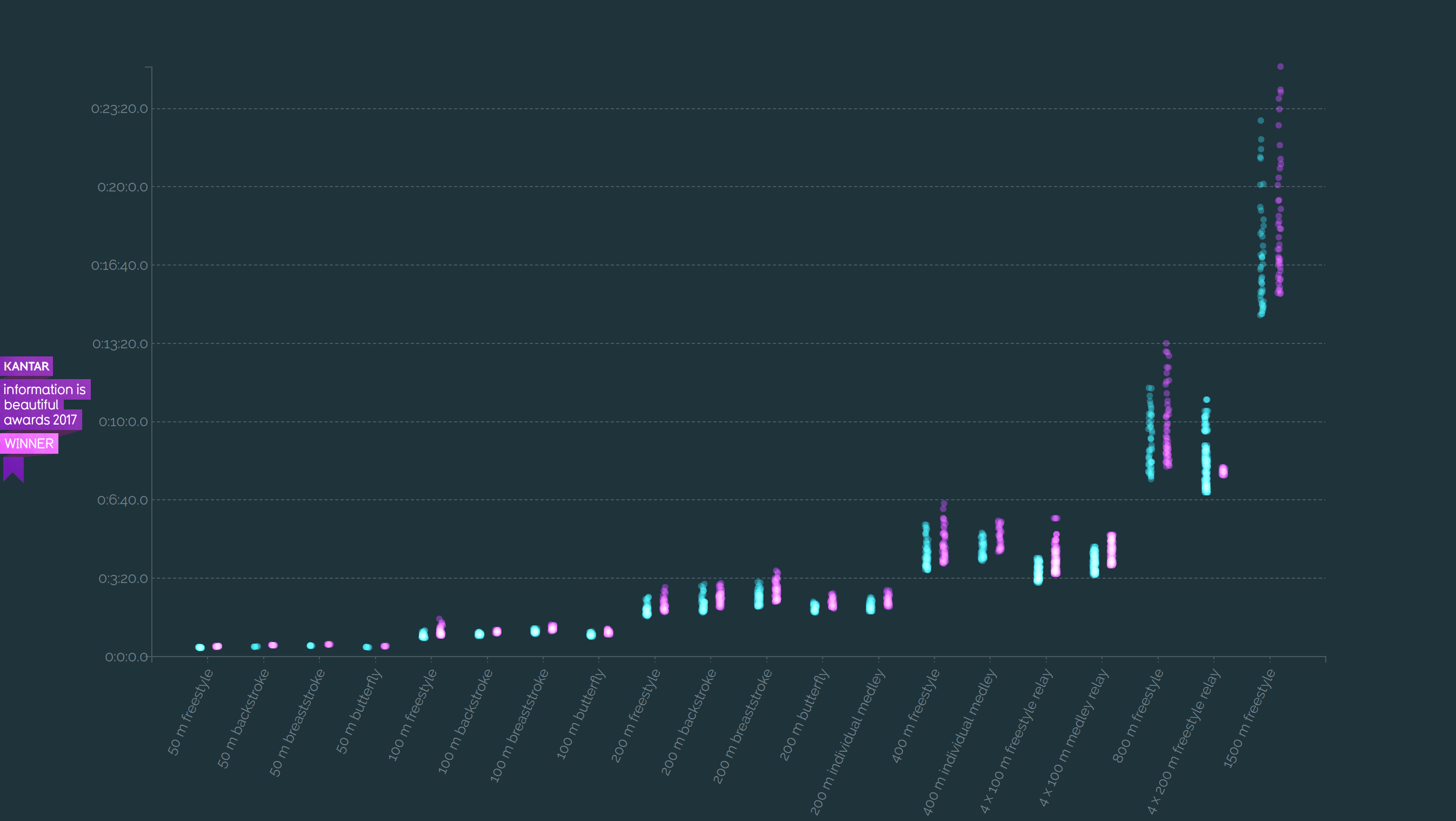
The last one provides information about range of times and nationality of the swimmers. I like how the data has been organized by categories: nation, event, and swimmer. The interactivity works well with this category, for example clicking on event, graph chart will show X as events name Y as swimming time, moving the mouse on the dot will show the swimmer’s name, time, country, and data information. Changing to the swimmer’s national data, it will show X as country and Y as an amount of the swimmers, but data is displayed as small dots all gathered. It’s hard to visualize the number of data. ‘Words, graphics, and tables are different mechanisms with but a single purpose- the presentation of information.’ (Aesthetics and Technique in the Data Graphical Design) I think the whole website graphic works really well with the concept. The fonts, navigation bar, and colors works well together to represent the information. This data visualization is a good example to learn and explore more creativity. ‘Swimming World Records throughout History’ is also won ‘Kantar Information is Beautiful Awards’ in 2017.